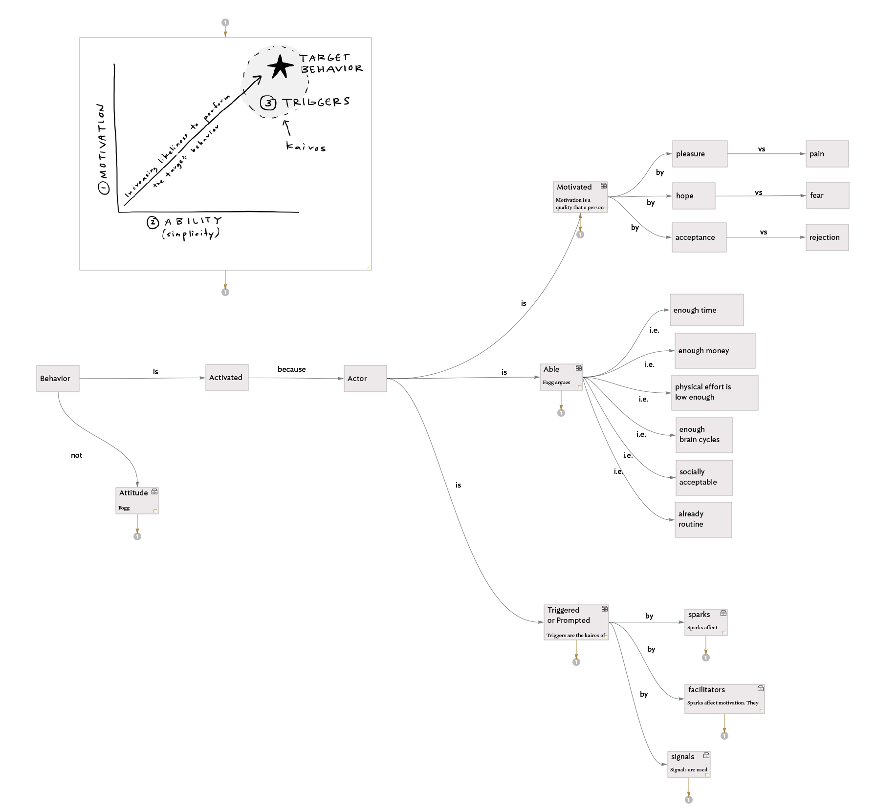
I’ve created a couple videos recently that demonstrate some techniques I use to make my Tinderbox maps a bit more aesthetically pleasing. It’s important to note that 1) as a designer; and 2) as someone who is encouraged to make more maps when my maps look nice, I value these tricks, perhaps, a bit too much. This is because some of them compromise the integrity of the data between linkages. This is shameful! (I know!) But alas I remain a bit shameless about it because I’m making maps that make me happy and the maps help me learn, so two wins, one loss… I’ll take it. Here they are:


